← All articles · Photo editing course · Part 4 of 12 · about 3 min read
Exposure and colour: reading the histogram, then fixing it (Part 4)
Most photos that look "wrong" are not badly composed — they are underexposed, flat, or lit by a colour the camera did not correct for. All three are fixable in under a minute if you know which control to reach for, and all three get worse if you reach for the wrong one.
Read the histogram before you touch anything
Open Window › Histogram. It is a bar chart of brightness: mountains piled on the left mean shadow detail, on the right highlights. A histogram that never reaches the right edge is a flat, hazy image. One that slams into the left edge and stops is crushed — you have lost shadow detail, and no slider brings it back.
The target is not a perfect mountain range; it is "information touching both edges without piling up against them". Once you can read that chart, exposure becomes a measurement instead of a guess.
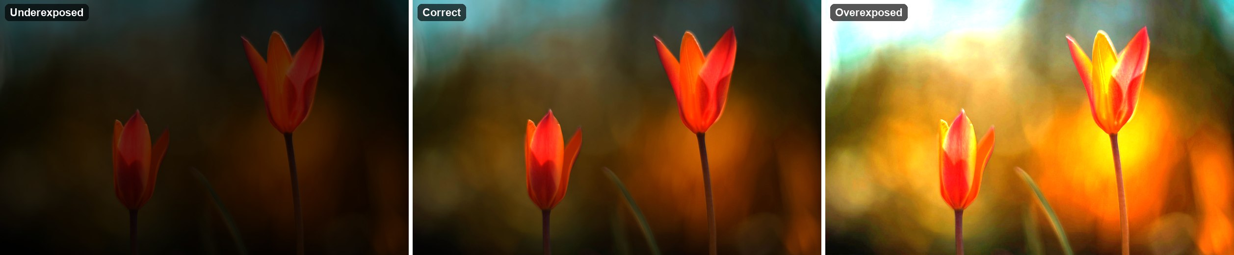
Levels: the three-point fix
Add an adjustment layer: Layer › New Adjustment Layer › Levels. Drag the black input slider right until it touches the start of the histogram — that sets the darkest pixel to true black and instantly cuts haze. Drag the white slider left to the end of the data. Then move the midpoint slider: left brightens midtones, right darkens them.
That single move fixes 80% of flat-looking photos. If you only learn one adjustment, learn this one. Because it is a layer, you can toggle its eye icon on and off to compare — always do that, the eye adapts to whatever it is looking at.
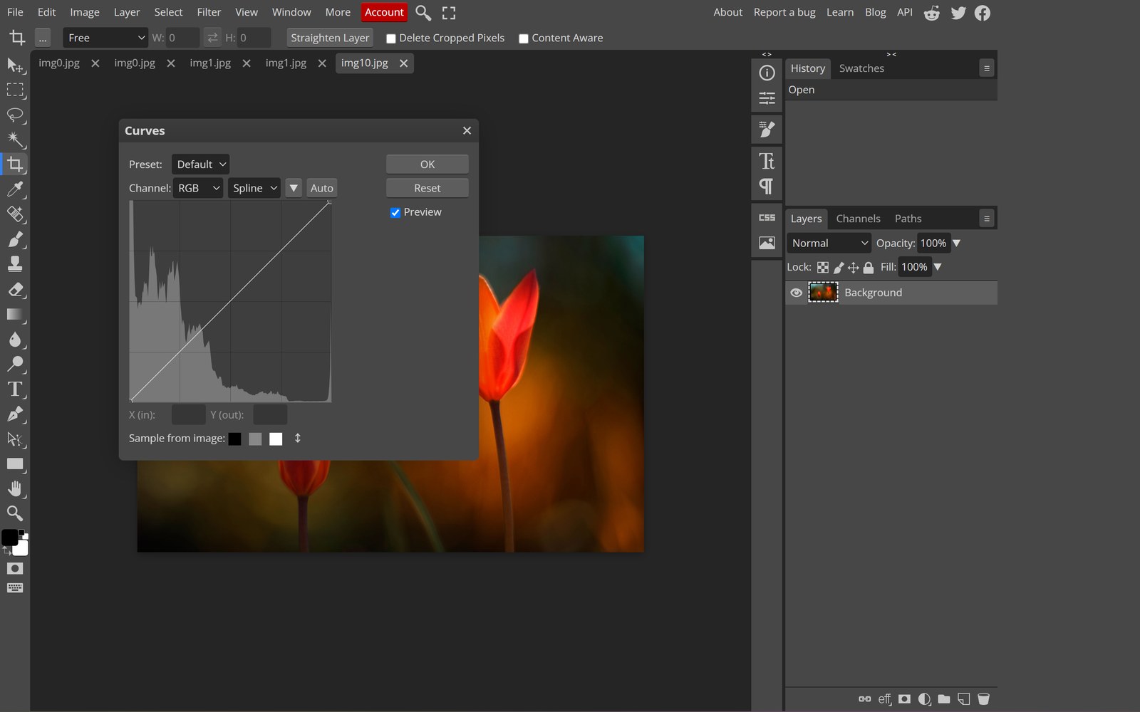
Curves: contrast with control
Curves looks intimidating and is not. Click a point in the middle of the diagonal line and drag it slightly up — everything lighter. Add a point low-left and pull it down, add one high-right and push it up, and you have an S-curve: deeper shadows, brighter highlights, more punch.
The rule that keeps it natural: small moves. A curve that looks dramatic on the graph usually looks like a filter on the photo. If skin starts looking orange or grey, you have pushed too far.
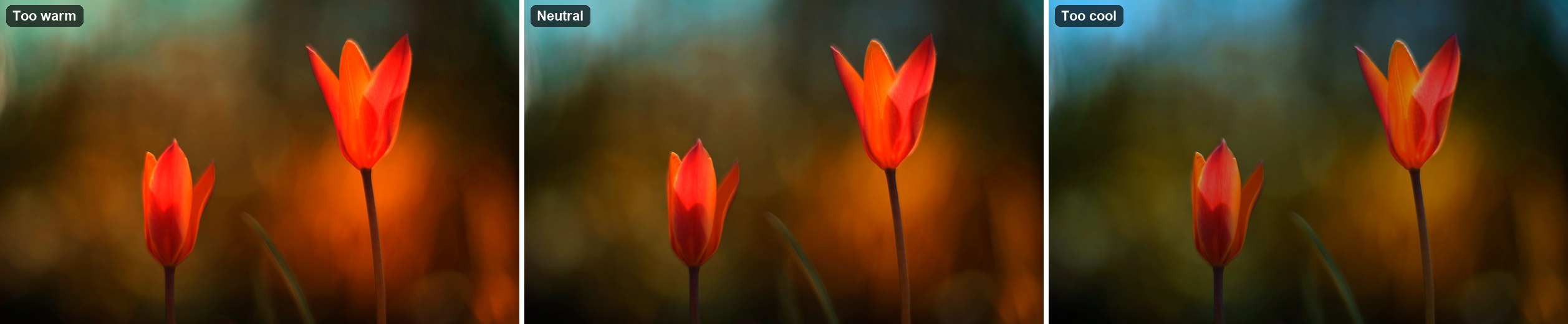
White balance and colour cast
A colour cast is a uniform tint — everything slightly blue under shade, slightly yellow under indoor bulbs. Fix it with Layer › New Adjustment Layer › Color Balance, adjusting shadows and midtones separately, or with Hue/Saturation targeted at one colour range.
Judging colour by eye is unreliable, because your brain auto-corrects. Use the eyedropper on something that should be neutral — a white wall, a grey card, a sheet of paper — and read the RGB values in the info panel: a true neutral has R, G and B within a couple of points of each other. That number is the ground truth.
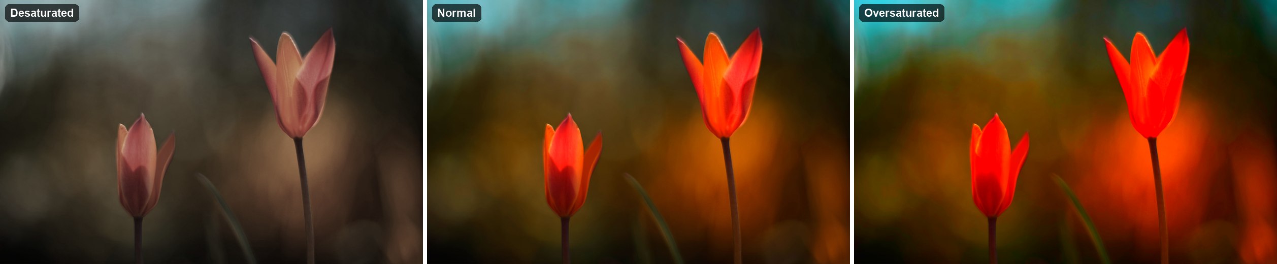
Vibrance, not saturation
Saturation pushes every colour equally, which is why over-saturated photos have glowing skin and clipped reds. Vibrance boosts the muted colours and leaves the already-strong ones alone — it protects skin tones by design. If a photo needs more life, vibrance at +15 to +25 usually does it; saturation is the last resort.
Tools used in this part
❓ Frequently asked questions
Should I edit a JPEG or convert to RAW first?
Editing a JPEG works, but every save re-compresses it. Do all tonal work in one session on one copy, and export once at high quality rather than saving repeatedly.
How do I fix a photo that is too dark to recover?
Raise the Levels midpoint and lift Shadows first; if noise appears, apply a light denoise. Detail that is truly black cannot be recovered — that information was never recorded.
Why do faces turn orange when I add saturation?
Because skin sits in the red-orange range and saturation amplifies it first. Use Vibrance, or mask the adjustment so it does not touch faces.