← All articles · Photo editing course · Part 10 of 12 · about 3 min read
Text, shapes and watermarks: adding type that looks designed (Part 10)
Adding text looks easy and usually looks bad, because type has its own rules: too many fonts, letters too tight, shadows too heavy. Ten minutes of learning those rules is the difference between a caption and a design.
Set type like a designer
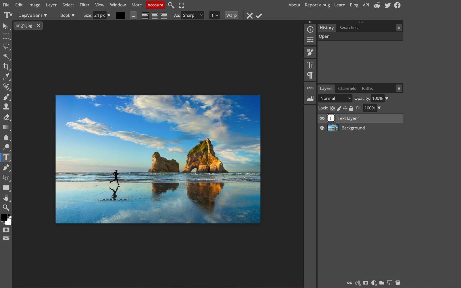
Use Type (T), click once for a single line or drag a box for a paragraph. Two fonts maximum on any image — one for headline, one for body, and often just one is better. Size the headline large enough to be read at thumbnail scale: if it is illegible in a 300 px preview, it is too small.
Adjust tracking (letter spacing) for headlines: slightly negative for large text, slightly positive for all-caps small text. Set leading (line spacing) to roughly 1.2× the font size for body copy. These two settings do more for perceived quality than font choice.
Layer styles: stroke and shadow, used sparingly
Double-click a text layer to open layer styles. A thin stroke in a colour sampled from the photo makes text readable over busy backgrounds without a heavy box. A drop shadow works at low opacity (30–40%), zero spread, and a blur radius roughly equal to the font size divided by four.
The most common mistake is a hard black shadow at 100%. It reads as a 2008 PowerPoint slide. Soft, offset, low-opacity — or better, a subtle gradient behind the text.
Shapes for structure
Rectangles and lines (U) give text a place to live: a translucent bar behind a caption, a thin rule under a title. Use the alignment controls to line elements up with each other and with the canvas — eyeballing alignment is why amateur layouts feel loose.
Building a reusable watermark
Create a new document at, say, 1200×1200 with a transparent background. Type your mark, set opacity to 60–70%, add slight letterspacing, and export as PNG so transparency survives. Now you have a single file you can drop onto any photo.
For a single image, place it bottom-right with a 3–4% margin and set the layer opacity to 40–60% — visible when looked for, invisible when not. For a whole batch, the watermark tool stamps text or an image across many files at once, which is far faster than doing it one by one in the editor.
Watermarks that do not ruin the photo
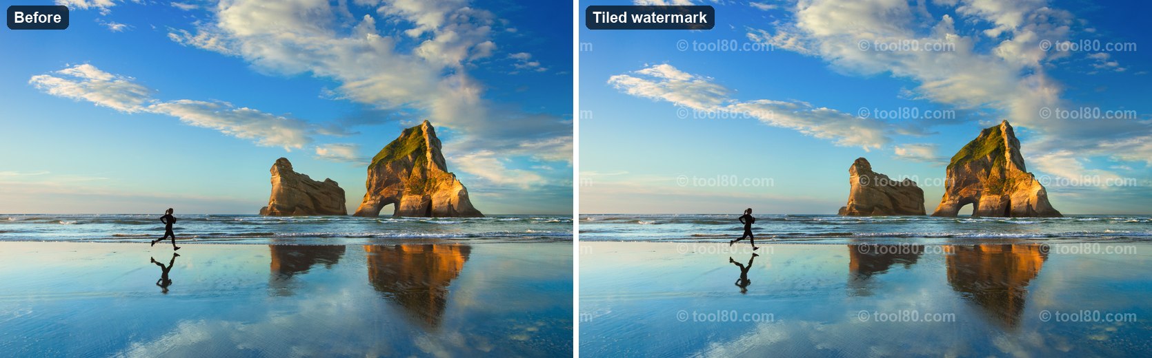
A watermark is a deterrent, not protection — anything visible can be removed. So optimise for not annoying the viewer: one corner mark, low opacity, never across the subject's face. Tiled watermarks across the whole image are only appropriate for paid previews, where the point is to make the image unusable.
Tools used in this part
❓ Frequently asked questions
How do I make text follow a curve?
Draw a path with the pen or shape tool, then click on it with the Type tool — the text runs along the path.
Why does my text look blurry?
It may be rasterised at a small size and then scaled up. Keep text as a live text layer and scale it before exporting, not after.
Can I save a watermark for later reuse?
Yes — export it as a transparent PNG once, then drag that file in whenever you need it. Keep it in a smart object so resizing stays sharp.