← All articles · Photo editing course · Part 12 of 12 · about 3 min read
A repeatable product-photo workflow for online sellers (Part 12)
Marketplace listings are judged in a thumbnail before anyone reads a word. What wins is not a beautiful photo — it is a consistent, clean, correctly sized one. This final part puts the whole course into a single repeatable pipeline you can run for every product.
The specs that actually matter
Most marketplaces want a square image, at least 800×800, ideally 1200–1600 px on the long edge, on a pure white background (RGB 255,255,255 — not 250, which some platforms reject), with the product filling 80–85% of the frame.
Set the crop ratio to 1:1 and leave consistent margin around the product. Consistency across a catalogue matters more than any single image being perfect: ten products with the same framing look professional; ten individually beautiful images with different framing look like a jumble.
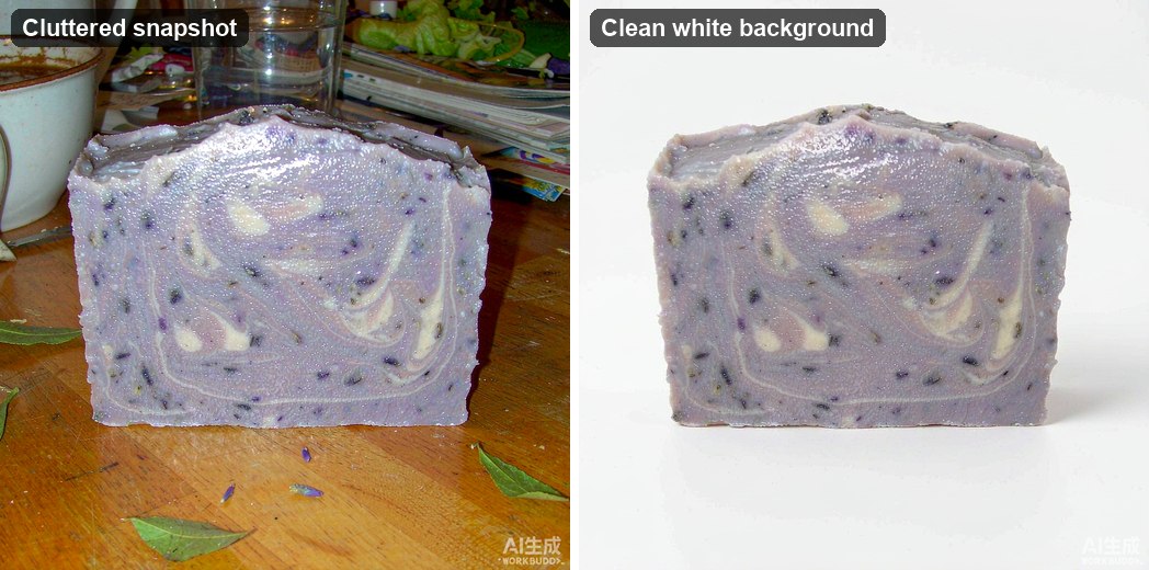
Clean the background to true white
Shoot or select on white if possible, then use Levels with the white-point slider pulled to where the background data begins. That pushes near-white to pure white in one move.
If the background is uneven, add a mask and paint the product back in, or use Select › Subject and place the product on a white fill layer. For high volume, the background remover followed by a white fill does this in seconds per image.
Fix colour honestly
Product colour is a legal-ish matter as much as an aesthetic one: a red dress that photographs orange generates returns. Use the eyedropper on a neutral reference if you have one, then verify with the info panel numbers rather than trusting the screen.
Avoid saturation boosts on products. Slightly desaturated looks dull in the listing and honest on arrival — the better trade for a seller.
Add a contact shadow, not a drop shadow
A product floating in white space looks like a cutout. Add a subtle contact shadow: a soft dark ellipse under the base, blurred 15–25 px, at 10–20% opacity. It conveys weight and position without looking like a 1990s web button.
Keep the shadow tight and grounded. A wide diffuse shadow reads as fog and makes the product look suspended.
Export the set in one pass
Save your working file as PSD so you can revisit it. Then export a JPG at quality 85, sRGB, 1600 px for the main image, plus a 800 px version for thumbnails if the platform wants separate sizes.
Name files by SKU, not by camera sequence — SKU-1042-main.jpg beats IMG_8841-final-final.jpg when you have three hundred products. Batch the whole catalogue with the same export preset and the set will look like one shoot.
Tools used in this part
❓ Frequently asked questions
Does the background have to be pure white?
For most marketplaces, yes — RGB 255,255,255 across the whole background, including the corners. Off-white is a common cause of listing rejections.
How many images per product?
Enough to answer the obvious questions: front, back, detail, scale, and in-use. Five to seven well-shot images outperform twenty near-duplicates.
Can I add my logo to product images?
Often yes, but keep it small and out of the product area — some platforms restrict watermarks and text overlays on the main image. Check the marketplace rules before building it into your template.